The DEITCHSTARTER
We've turned to Kickstarter to raise funds for our Kim Deitch project, hopefully debuting later this year at the SPX festival in Maryland. Head over here to help make this project a reality!
Posted on by Jordan Hurder
We've turned to Kickstarter to raise funds for our Kim Deitch project, hopefully debuting later this year at the SPX festival in Maryland. Head over here to help make this project a reality!

Posted on by Jordan Hurder
Justine and I decided to invest in a new inkjet printer that can print whopping 17" x 22" pages! Some of the scans that Kim Deitch sent over are 17" x 22" and doggone it, I just didn't want to size them down to print on our current printer! This, of course, means that the deluxe edition will be a gargantuan 18" x 24" hardcover! Dang...

Posted on by Jordan Hurder
Announcing the newest Chance Press project, which will hopefully debut at the Small Press Expo in September 2014: A Deitch Miscellany.
The centerpiece of this book is "Sex, Drugs, and Sweet Music" (originally published in Kramers Ergot 7), which will be reproduced both in color and black-and white. With full-color artwork and sketches from books present AND future, this will be our most ambitious project yet.
We're planning two versions: a deluxe edition limited to no more than ten copies in oversize 15" x 20" format, replete with fine art prints and handbound in boards, and a traditional album-sized trade edition.
We prefer not to take preorders or advance deposits, but you can email books@chancepress.com to have your name added to the list of those who will get first crack when we release the book.
Posted on by Jordan Hurder
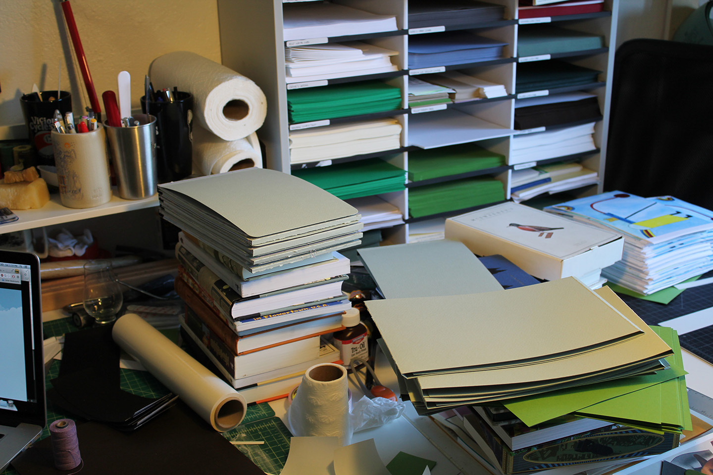
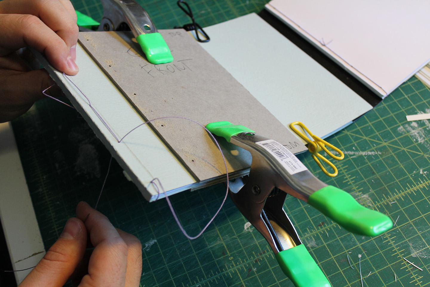
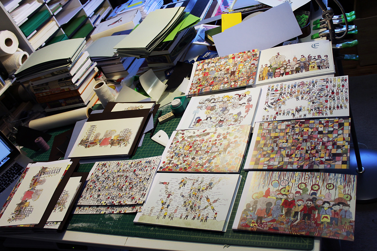
We're really getting close now... here are some photos from this weekend's work session. More to come tomorrow!
Click photos to scroll through the slideshow.
Posted on by Jordan Hurder
Chance Press, in its current form, has hit a wall. The first problem is that, due to our mission of doing everything in-house and (where possible) by hand, we can’t offer artists the exposure that they need. Why would someone give us work for an edition of 50 copies, when they could Kickstart a book themselves and produce 2000, get them into bookstores, sell at cons, etc? It’s a wise business decision NOT to work with us. The second problem is that there is so much stuff we want to publish that we aren’t able to, since we just can’t produce at the level that would sustain multiple releases per year. We both work full-time at demanding jobs, and Chance Press is a money-losing labor of love that we do at night and on the weekends. My natural enthusiasm causes me to take on too many projects, which then stresses me out about how much work I have to do, which leads to procrastination, which leads to release dates getting pushed back. Our sporadic release schedule in turn lowers our profile, since people forget about us in the long stretches in between when we release books.
I’m incredibly proud of our fancy books, starting with Scribbles in a Sandstormthree years ago, continuing with Some are Young and Some are Free in 2011/12 (yes, we worked on this one for over a year), Furlqump, and soon,Neil Farber | Carol Es. However, if we continued to run Chance Press as we have in the past, I fear that it would run itself into the ground, which wouldn’t be any good for our collectors, the artists we’ve published, or our own well-being.
In thinking about how to change the format of our press, I also started thinking about what we can add to the world of small press publishing. The way I see it, there are a lot of publishers who are artist-centric. They produce editions with high print runs in order to drive exposure for their artists, and they are often times run by artists. What I don’t see as much is publishers who are collector-centric. People tend to be cynical about editions catered to collectors - they’re needlessly expensive, they’re manufacturing rarity, etc. I disagree, mainly because I am a collector before anything else (publisher, book-maker, leprechaun, etc.), and I truly appreciate when publishers pull out all the stops to make books that are uncommonly beautiful. Building Stories, check. The hardcover edition of Big Questions, check. Everything released by Fulgencio Pimentel, check. I view these collectors editions as celebrations of art, of book art, and of people who keep artists rolling in dough (since artists are all rolling in dough) by spending their money on this stuff.
I make books that I want to own, period.
That simple mission statement needs to drive what Chance Press does in the future. Rather than trying to figure out how to market better so we can become an artist-centric press and get into the game of providing exposure for new artists, or changing our business model so we can do runs of thousands of copies like Yam Books or Uncivilized, we’re going to think smaller, fancier, more expensive, etc. Anything else isn’t playing to our strengths as much as it is playing to my idea of what a successful publisher is. We’re going to come up short every time if we try to be Yam Books, because that isn’t what we’re good at.
So, the announcement: Neil Farber | Carol Es will be the last art book published under the old pattern of releasing a book whenever we happen to be done with it. Going forward, Chance Press will consist of an annual book art project, released in the fall to coincide with the Fall/Winter convention season. Each book will be extremely limited, very expensive, and designed for obsessive collectors like me.
The 2013 edition is already halfway done: Blast Furnace Funnies by Frank Santoro. If you’ve been following this blog for a little while, you’ve seen the scale we’re talking about - five large format copies, each one meticulously printed, assembled, and bound by hand in our El Cerrito apartment. Only three copies are left for sale at this point, so if you’re interested in getting in on the ground floor, I’d advise shooting us an email to express your interest.
Although each book will be totally unique, the annual release will include a book about the production of the book that will stay in the same format year-to-year in order to add continuity. I’m already kicking around proposals for the 2014 project, and I’m certainly interested in hearing your ideas. Also, if you’re interested in being on the list to have first crack at these annual releases, just email us: books at chancepress dot com.
(One note: this all applies to the side of Chance Press that publishes fancy art books. There's still the (somewhat dormant) side of the press that publishes poetry, fiction, and essays, and that side isn't going away. In fact, streamlining the art books via an annual release schedule will free us up to publish MORE little books. What it does mean, however, is that you will likely no longer see books like Furlqump, which were published in multiple editions of escalating complexity.)
Posted on by Jordan Hurder
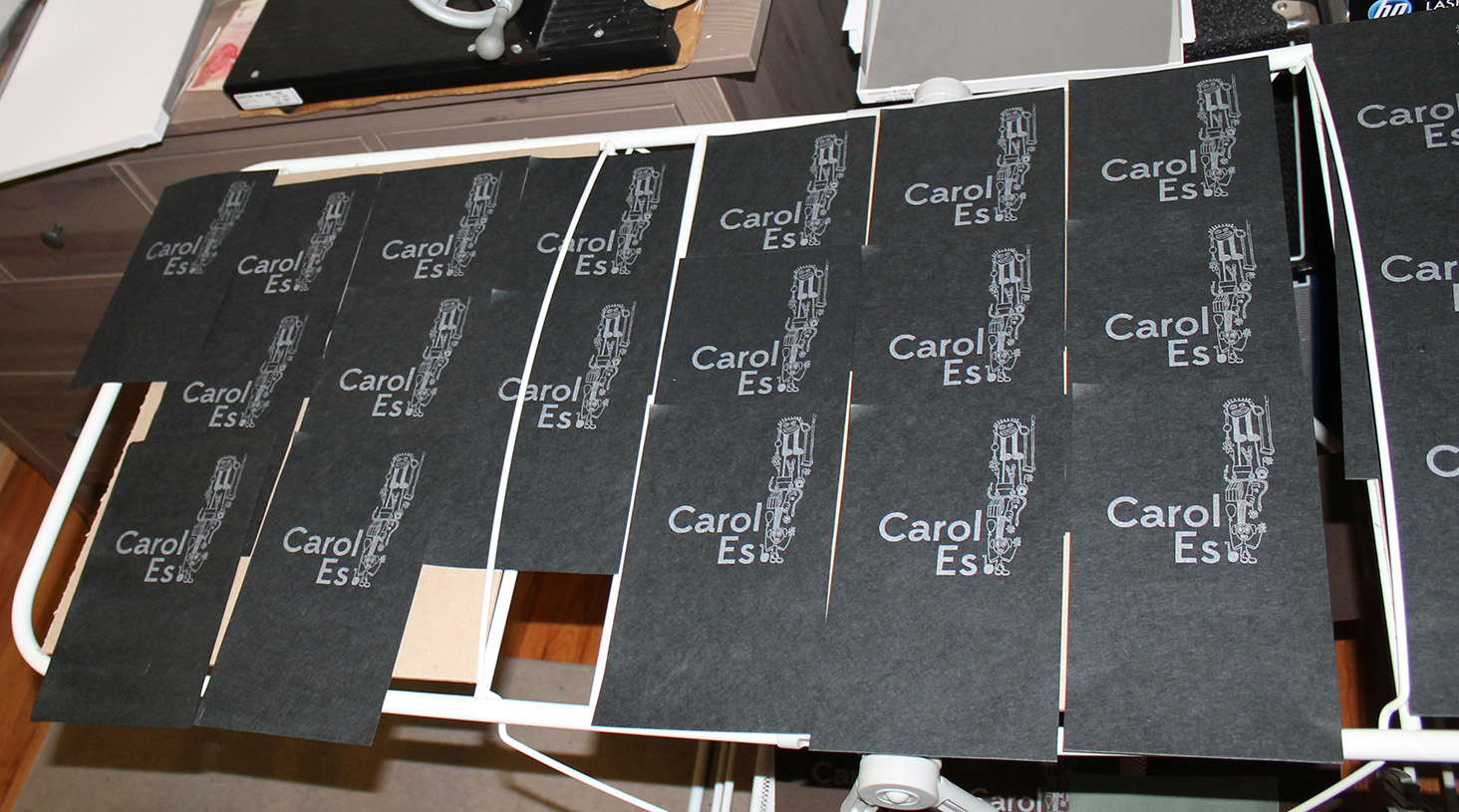
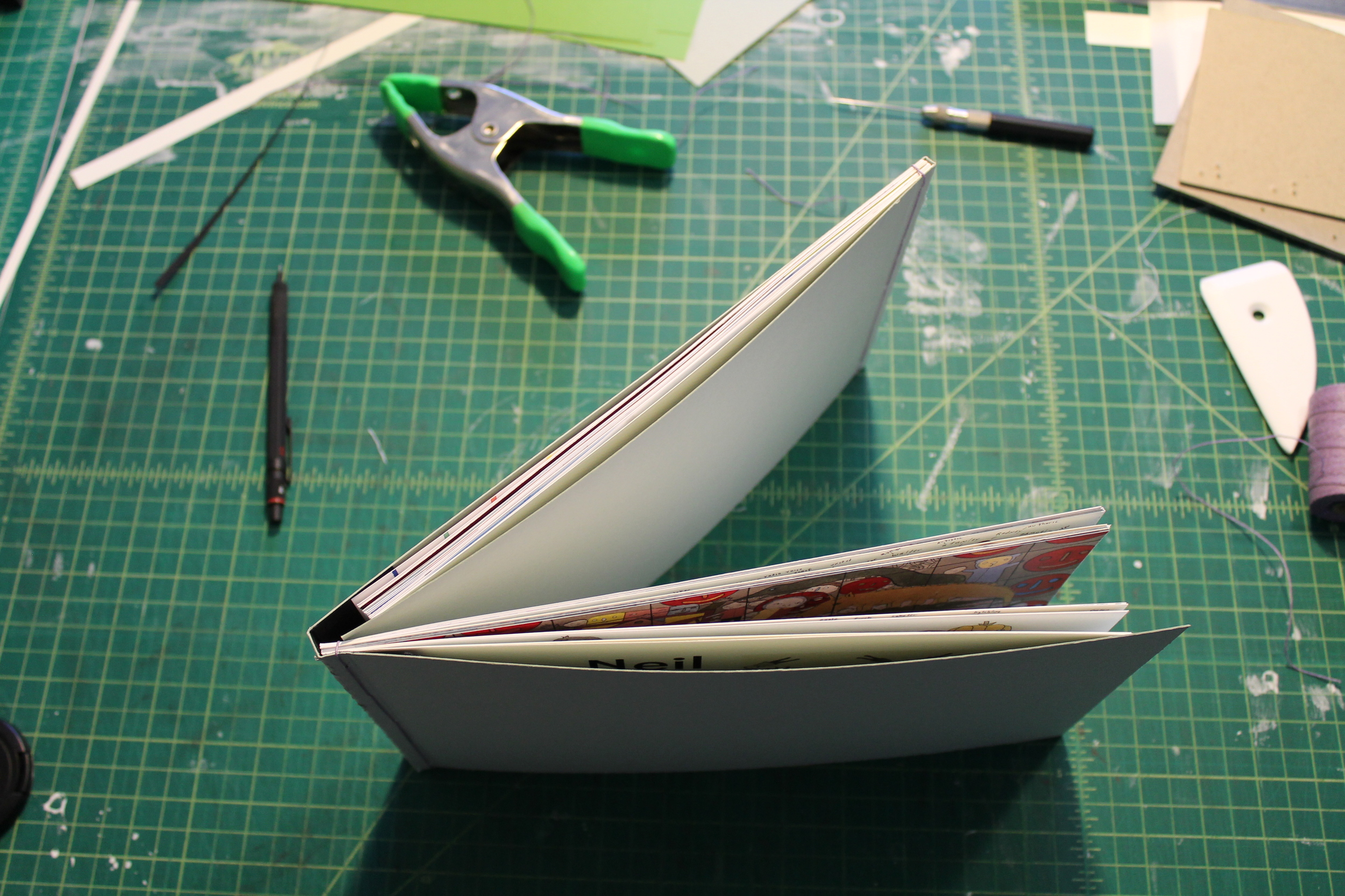
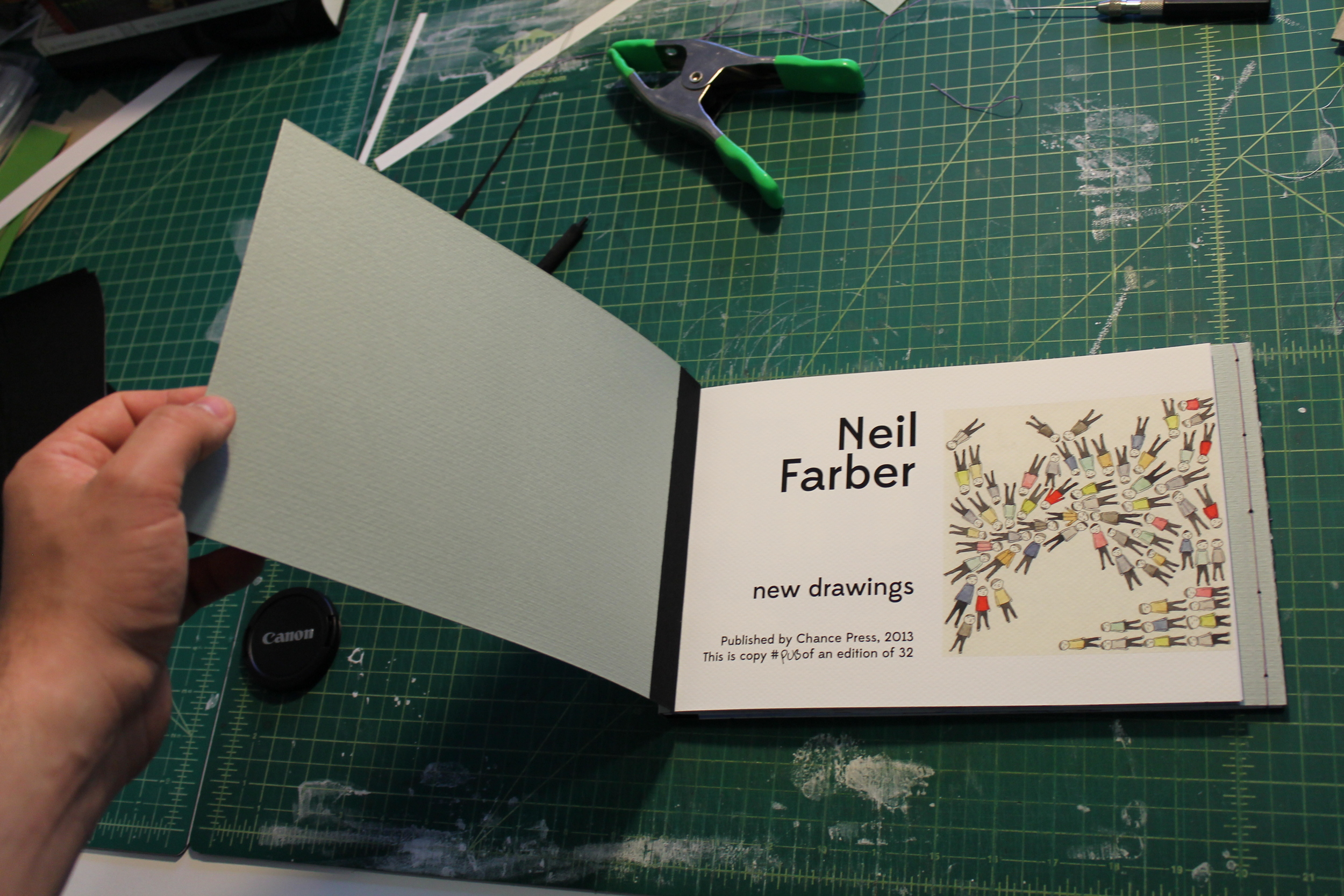
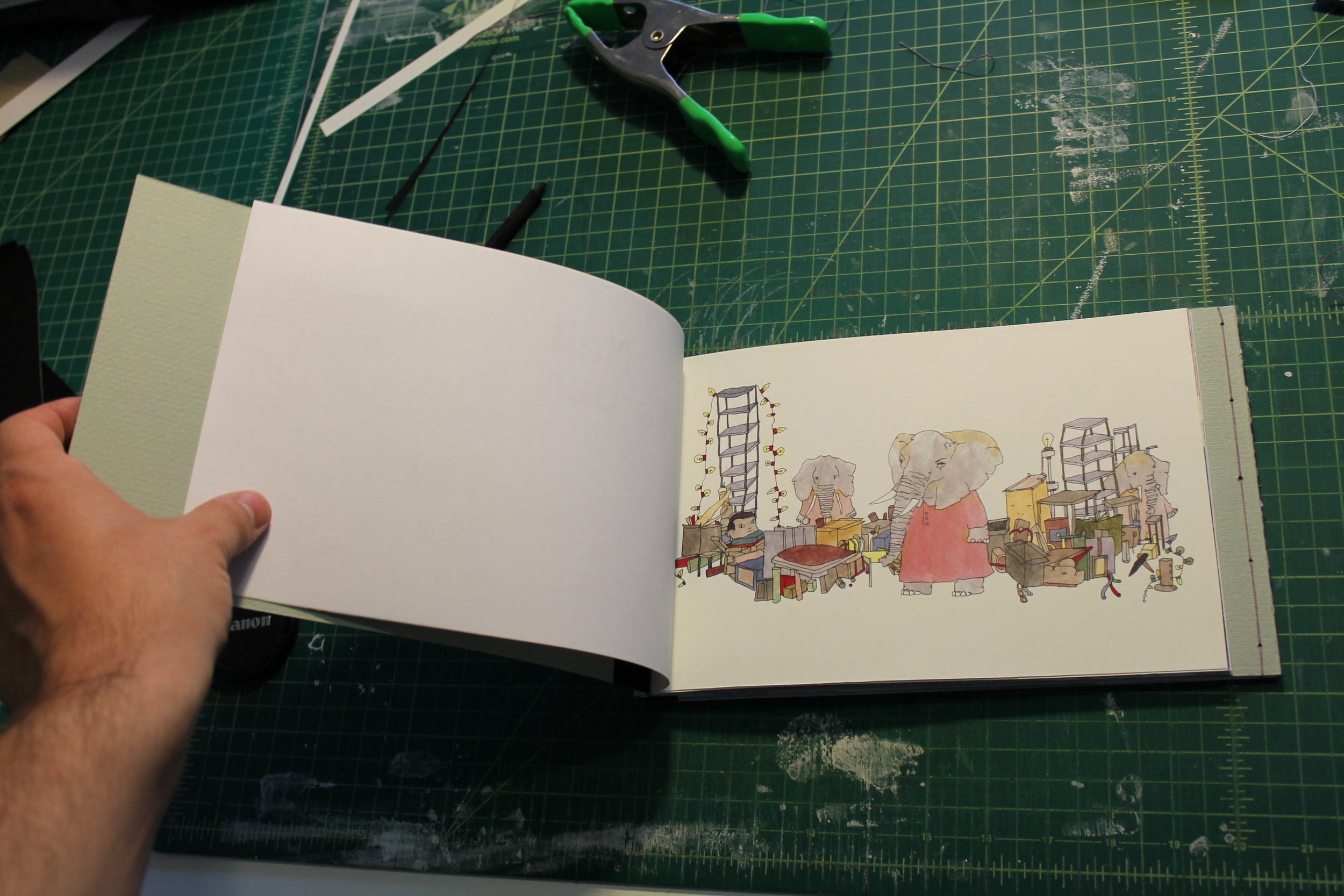
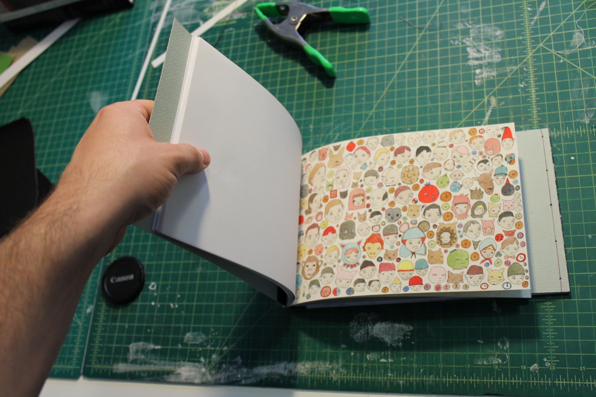
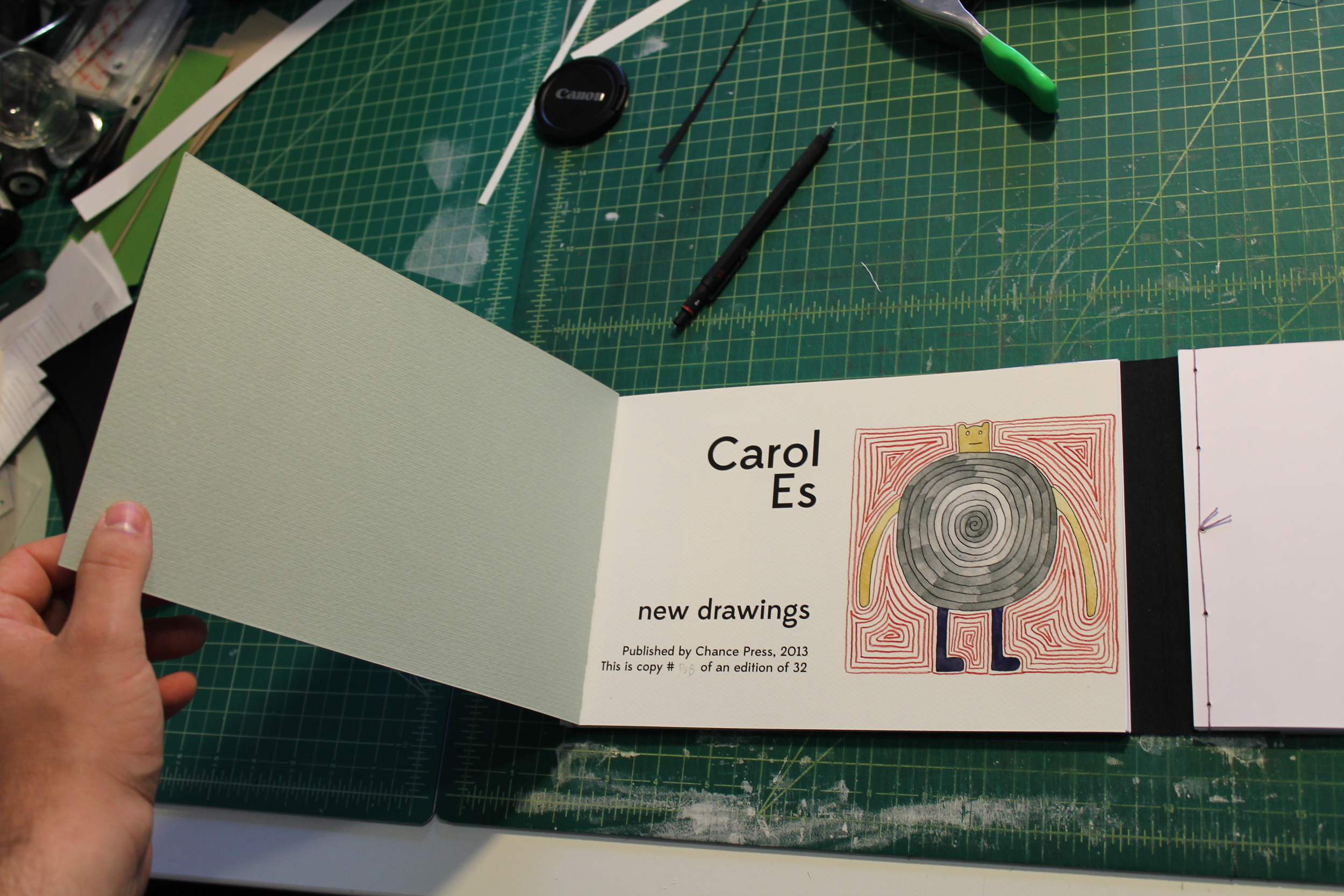
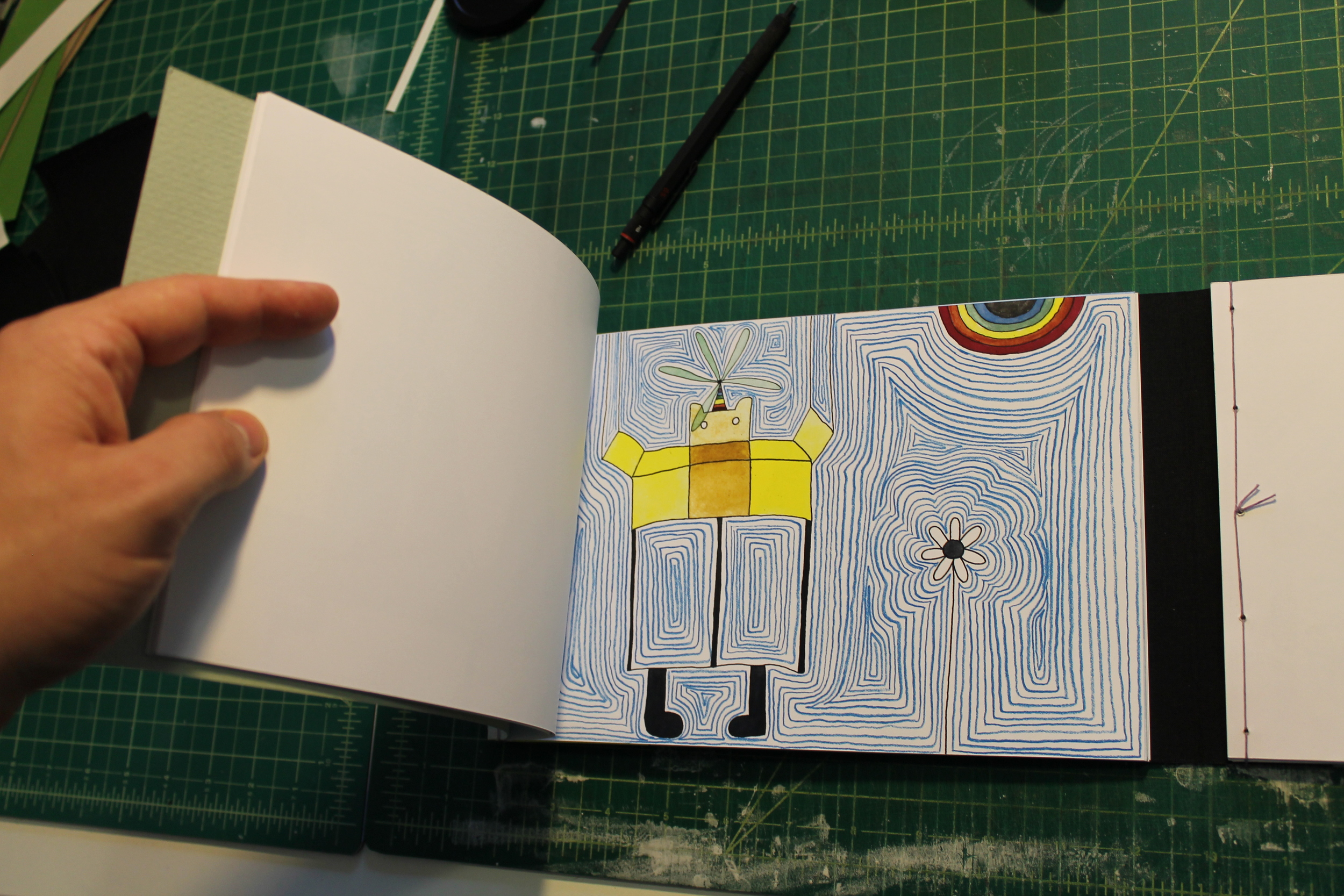
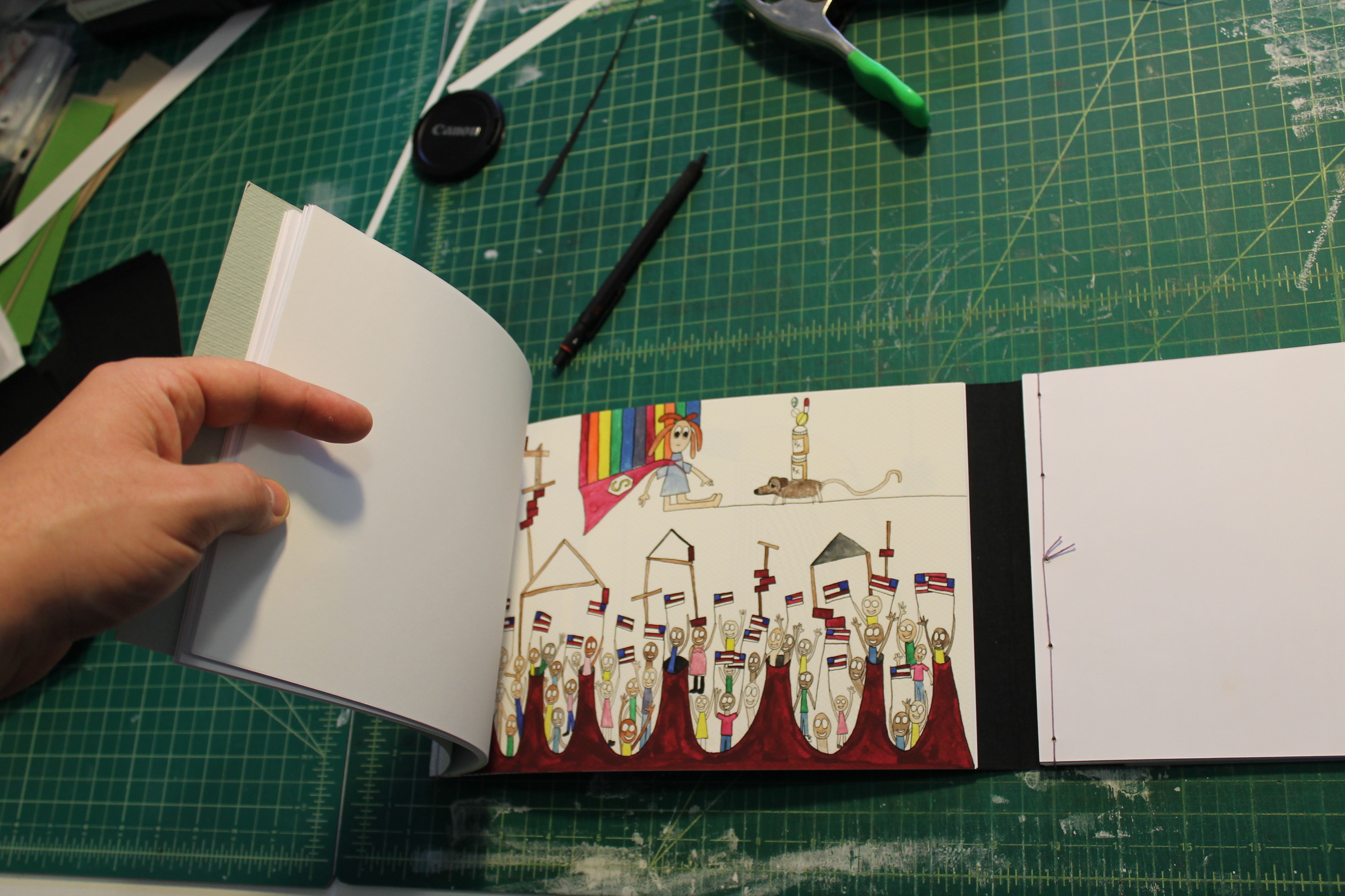
Well, this spring has been unexpectedly busy for non-book reasons, so our output has been expectedly slow. But! We're working! Here is a photo of the first fully-bound version of our Neil Farber | Carol Es book that will be available early next month. This copy is missing the cover plates, which are still being designed. Otherwise, this is how they will look.
Here are some deets:
-Bound in a single 33" long sheet of Fabriano Murillo mould-made paper.
-Stab-bound by hand with waxed linen thread in two opposing sections.
-Sports a spiffy cover plate of an original image printed either letterpress or silkscreen (TBD) on jet-black Japanese Kozo handmade paper.
-Includes 16 new & unpublished ink and watercolor drawings by each artist plus an original title page plate. 15 drawings are digital prints on Hammermill 80lb cover stock, and one drawing plus the title plate are printed using archival pigment ink on Canson Mi-Tientes paper.
-Includes an archival pigment ink print on Cason Etching Rag of a collaborative drawing by both artists. This is a big deal (trust me).
-Signed by both artists (as is the collaborative print).
Limitation: 30 copies, 18 for sale.
(Click the images below to scroll through the gallery.)
Posted on by Jordan Hurder
According to this book collecting blog, it is "silly" to designate a small number of limited edition copies out of an already small print run, and the writer kindly cites our book of poems by Joan Jobe Smith as an example. It's just something publishers do to generate extra money from their stupid collectors who actually care about crap like limited edition books. I've heard this before, and it never gets old, believe me. Thanks for your normative statements, blog writer. Let's not forget that the $10 we charged for the book pictured in the article just about paid for the fancy paper the book was bound in. We're really living large on the backs of our collectors, we are. Still, we've realized that we should stop being silly, and all further releases from Chance Press will be printed in large runs in economically priced editions, since we wouldn't want to defraud collectors by making our books "artificially scarce."
Posted on by Jordan Hurder
Now that the printing is underway after the most rigorous proofing process I've ever undertaken, it's time to make a book out of each stack of prints. First, each print needs to be trimmed to size, preserving the deckle edge along the bottom. (Can I just say how excited I am that each print has a deckle edge on the bottom? Most inkjet paper has clean edges, and deckle edges can make printing difficult by picking up stray streaks of ink, but it's worth it when you see the final product.)
Also, before anyone jumps down my throat and gets on my case about how giclee is just a fancy word for "Inkjet" and that I shouldn't be acting like these prints are such a big deal... first, you're mean. Second, that's technically true, although most inkjet printers that any normal person can afford require a lot of babysitting, and with each print taking around 10 minutes to produce (depending on the image), printing this book is a significant time investment. Third, there is about as much handwork in each print as you're likely to encounter in a giclee. Here's a quick step-by-step (some of which is documented in previous videos):
Then, once the prints are ready, they need to be adhered into the book. For the main pages, I'm using a really fancy pastel paper made by a company called ShiZen out of recycled pulp. It has a really soft feel, almost like a worn-out dollar bill, but sturdier and heavier. (Side note: each sheet of this paper also needs to be trimmed to size - there is literally nothing in this book that I will be using straight from the package.) In most books where I'm adhering prints, I would use a double-sided tape that can be verified as chemically stable (like 3M Preservation Tape) or a pressure-sensitive substrate like Gudy O, although neither of those will really work, due to the properties of the ShiZen paper. Most paper is fairly "hard" on the surface, meaning all the fiber is pressed really closely together. This is the opposite - you can tell by very lightly rubbing an eraser on it - you'll get stray fibers on the eraser no matter how lightly you go. On paper with a hard surface, good pressure-sensitive adhesive (that maintains its adhesion over time and doesn't dry out) will work for many years, since it has a strong surface to adhere against. (Professional conservators will dispute this point, and they are right, but for practical purposes, pressure-sensitive adhesives that have passed the photo-activity test will be fine. This is the small press, not the Louvre.) With softer papers, however, the pressure sensitive adhesive wants to pull the looser fibers off of the paper, and when you're dealing with heavy, large-format prints, this is a concern. As a result, I'm using my go-to glue for bookmaking applications, Beva Gel. I have talked about this subject at great length here, which you can read if the above hasn't yet bored you to tears, but suffice it to say that Beva Gel has numerous advantages over PVA, which is the most common adhesive used in bookmaking.
So, the video above shows the process of gluing the prints into the book. Because each signature (folded sheet) needs to be dried under weight, it is necessary to assemble the book signature-by-signature (page 1, page 16, page 2, page 15, etc., instead of pages 1-16 in order). This video only shows the first signature being assembled, so watch it four times to get a sense of what assembling the entire book would look like. You may notice that I'm only gluing the top half of each page - this is on purpose, since having the bottom edges loose just looks and feels better than rigidly adhering every inch of the print to the page. Trust me.
This will be the last process post for a while, since printing and assembling the signatures will take me most of the next month (at least), and I have some work-related travel coming up that will throw me off as well. Thanks if you have been reading so far! After this, it will really get good, since I'll be printing the cover, sewing, binding, and all that good stuff.
Oh, one other thing - you may notice that the workshop looks different. You're right! Justine and I recently swapped our large bedroom and small workshop, so now there's almost twice the space, plus we can both work in the shop at the same time - imagine that, both co-publishers publishing at the same time! Now you're all in big, BIG trouble.

Posted on by Jordan Hurder
We have a cover! I had originally planned a very plain cover with just some text, since the 16-page newspaper was intended to be a standalone object. An elaborately designed title page would be redundant, and a new panel would probably disrupt the balance of the comic, which is one of my favorite things about it. I kicked around a few designs, but the more I stared at the pages during proofing and the initial rounds of printing, this idea came to me. The image below is not complete (there are some gradient issues with the background that need to be sorted out), but this will be the basic design for the cover.
Astute readers will note that this image is 10" wide, and the stated size of the book is 14" wide. The actual book will be bound in black cloth, with this image adhered to the front cover so that it extends over/around the bottom and the top (the bottom of the image you see below will be flush with the bottom of the book), and 2" of black bookcloth on either side. I haven't made a mockup of it yet, since I want to finish most of the printing first, and then I can get to work on the binding.
Posted on by Jordan Hurder
In case you want to see how the sausage is made while listening to hard rock music.
Posted on by Jordan Hurder
One of the perks of my new job is that I have access to a laser cutter that I can use to cut bookboard into precise shapes. For anyone unfamiliar with bookboard, it isn’t like cardboard, thick paper, or illustration board - it’s incredibly dense, made up of layers of different materials mashed together into a rigid board. Cutting even mid-weight bookboard by hand is nearly impossible, and the shape you see here would take hours and multiple x-acto blades and still not look nearly as good as this one. (In case you were curious, this board will make up the cover of the Carol Es | Neil Farber deluxe edition we’re working on.)

Posted on by Jordan Hurder
Well, last night's experiment with different types of paper was a rousing success. The gray Rives BFK paper treated with digital ground approximates the look and feel of newsprint while still allowing crisper and more saturated colors. This is exactly what I was going for... plus, it means that I can use Rives BFK for this book, which is just about the most luxurious paper around. (Sure, there are fully handmade papers that are nicer, but no other mass-produced paper approximates BFK's soft face, uniformity, and workability.)
Here, you see the original newsprint comic in large format, with three tests on the right. The top is Rives BFK, the middle is Rives Heavyweight (which is actually lighter weight than BFK), and the bottom is Arches Aquarelle digital art paper. The Heavyweight paper is nice, but it is too cream/yellow colored, which oversaturates the colors. The Arches prints look great on their own, but next to the newsprint, it's clear that the white color is too vibrant for this project. While the BFK isn't exactly the same shade as the newsprint, the gray color cools off some of the eye-popping magenta tones, which will be especially important on the pages where this is the dominant color.
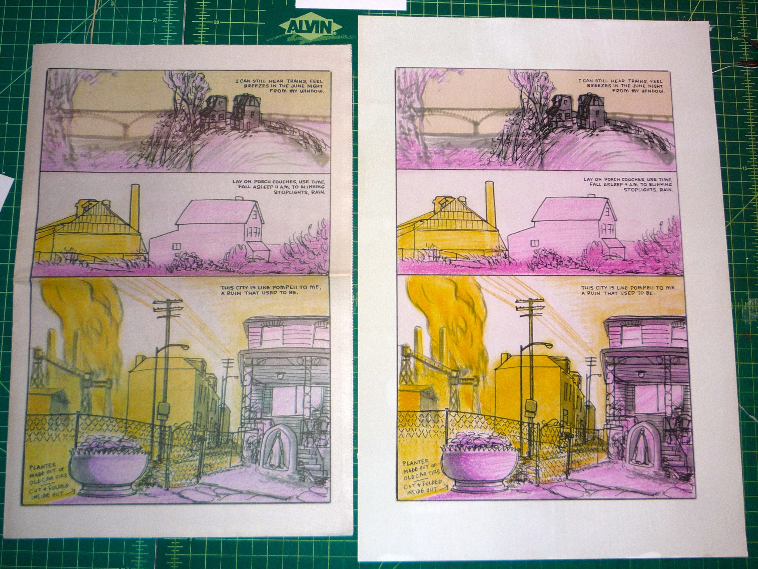
Here is the first full-size test print. I'll be printing the book on 13" x 19" sheets and then cutting them down to 11" x 17" since painting on digital ground can cause the edges to warp a little bit, which causes the print head to leave black trails around the edges. It didn't happen on the print above, but it's inevitable when working with these materials, so this way I'll be able to trim off the edges to clean up the prints before I glue them into the book. I'm so excited about the above print that I want to get Frank to sign it so I can frame it on its own. I'm not excited about individually treating 112 sheets with digital ground, but I know I won't be happy with the book otherwise. (Plus, this will be marginally cheaper than buying pre-treated paper, as long as you don't count the estimated 12-15 hours it will take as having any monetary value.)
Posted on by Jordan Hurder
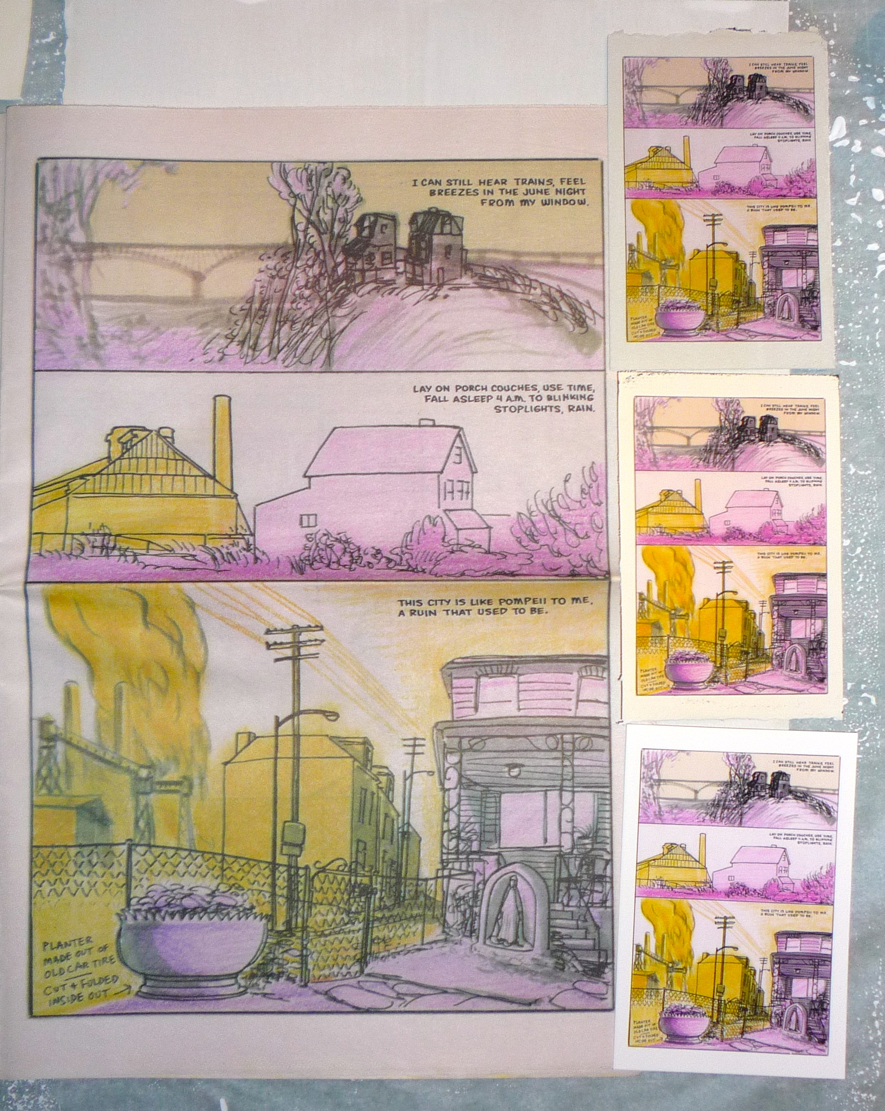
For Blast Furnace Funnies, the printing is critical. The way the main edition is printed, and even the ephemerality of the surface (newsprint), is tied directly to the content of the comic, so I need to be very careful about how I choose to render the book in the deluxe edition. The artwork files Frank sent are flawless, so it would be very easy for me to pick up a bunch of packages of Canson Edition Etching Rag (my favorite digital art paper) and start running prints. The problem is that they would look too perfect. The point of this project isn't to fix anything wrong with the newsprint comic, but rather to commit it to a more permanent medium that celebrates the comic's awesomeness in the presentation.
So, here are the first six test prints I did. I'm running these as 4" x 6" mini-prints before I move to the full 11" x 17" size. You can't tell the difference in the pictures (except for the top left print with an "X" through it, since my printer was running out of magenta ink for that one), but rest assured, I have been examining them closely to find the best paper and ink profile for the job. There are so many things to consider here - for instance, the print on the bottom right is probably the closest to what I'm trying to achieve due to the creamy-colored paper that warms up and softens a lot of the colors in the artwork, but that paper has a unique honeycomb texture that looks altogether too uniform and orderly for the artwork. A slight watercolor paper texture is okay, as long as it appears random.

The problem here is that almost all digital art papers are some degree of white, since inkjet coating is always white. If i want to approximate the feeling of newsprint, I'm going to need to get more creative. One thing I have done in the past is incorporate digital ground, which is a thin white coating that prevents the ink from being absorbed into the paper. (If you try to print with pigment ink onto untreated paper, it will blot into the paper and look fuzzy and washed out.) Digital ground dries white, but if you don't apply multiple coats, you still get some of the paper showing through, so I picked up a couple types of paper that are darker than what I actually want, hoping that maybe the paper + the digital ground will be the right shade. I tried a couple tests on cream-colored Rives printmaking paper and gray Rives BFK paper, spreading the ink on with a foam silkscreen brayer, and we'll see how the pages turn out when they're done drying. It's almost impossible to get a uniform coating with digital ground, so some brush strokes will always be visible. That might be okay, though - the goal is to make sure the prints don't look too perfect, and some evidence of the handmade nature of this edition could complement the comic just like the newsprint does in the main edition. We'll see when I run the test prints tomorrow.


Posted on by Jordan Hurder
Today, we secured the rights to publish a deluxe edition of Blast Furnace Funnies by Frank Santoro. No joke, this is one of the very best comics to come out in years - "a heartfelt postcard to my hometown" in the artist's words, Blast Furnace Funnies uses the backdrop of Pittsburgh, PA, rendered in Santoro's exquisite style, to wend its way through a meditation on memory, home, and the inevitable passage of time. I could go on and on about this comic, but Copacetic Comics has a great description of it:
“2011 marked the culmination of a decades-spanning career arc as Frank Santoro found his art at the center of the 2011 Pittsburgh Biennial at The Carnegie Museum of Art, where he attended studio art classes as a youth. We are excited to at last be able to offer for sale copies of his 16-page tabloid newspaper comics work that was the highlight of that exhibit. In a signature Santoro move, Blast Furnace Funnies is a work of “High” (i.e., museum quality) art executed in the lowest of the “Low” art forms (a disposable newspaper); employing ephemerality to evoke eternity, he has here worked (in a form that often ends up) in the gutter to reach for the stars. The originals for all 16 pages of Blast Furnace Funnies were exhibited at The Carnegie alongside of a giant stack of the newspapers we’re offering here, and they really stood out on the walls for the wide tonal range displayed on each page; from wispy grays to solid blacks, from strong straight lines to streaks, curves, scribbles and blurs, each page contained marks made to match the mood. The color scheme of the newspaper itself is a duo-tone of varying saturations, consisting of yellow and magenta, that yields a surprising variety of hues, suggested and actual. The message that Blast Furnace Funnies has to deliver is a meditation on the relationship between the here and now and the past and gone that is, critically, played out in parallel on the scales of the personal and the historical. The narrative works to convey how we use our sense of the historical to understand our own lives – and even more, to suggest that, at the end of the day, all we really have are our own personal histories; that perhaps the ultimate function of the history that we learn from books and at school is to help us come to grips with existence. We all live in a relentless forward motion, each moment is here and then it is gone, replaced by the next and never to be physically experienced again. The memory of each moment is, however, in the context of an individual’s own life – and, like “historical” events – always there. The personal is the historical. Memory is history. Pittsburgh is Pompeii. ”
Despite the thematic benefit of the newsprint format described above, I have never been able to shake the feeling that Blast Furnace Funnies deserves an archival presentation. As a book collector, this is the kind of stuff I obsess about, and after a year or so of wishing that someone would reprint this comic in a sturdier format, I decided to get in touch with Frank myself.
Because this book will be made entirely in-house, there are a number of constraints we need to take into consideration. First and foremost, we're printing it full-size, which means each page will be 11" x 17". We don't have a laser printer capable of printing in that size, so each page will be run through our Epson printer individually. We'll be using archival cotton rag paper and Ultrachrome K3 ink to guarantee that the pages look as close to the original art as possible. The book itself will be an enormous hardcover - nearly as big as Kramers Ergot 7 - bound entirely by hand with no expense in materials spared.
This book is meant for collectors - the original comic is still available online from Copacetic Comics and PIcturebox, so this is a different situation from when Picturebox reissued Storeyville years after the original newspapers had vanished. I'm basically putting my money and time on the line (one might even say I'm selling my boots) in hopes that there are a few more people out there like me who really dig this kind of over-the-top bibliophile stuff.
The final details are still moving around, but here's what I know so far: the price will most likely be $300 + shipping, although I won't know for sure until I see how much the book costs us to make. It will be ready sometime in the summer or fall of 2013, and we won't be taking preorders, since it's never a good idea to take money when you don't know when you'll be able to deliver. We will make five copies to start - if these copies sell out right away, we may make another five. If you'd like to be notified when the book comes out, email us using the contact form on this site.
Posted on by Jordan Hurder
Neat stuff! We got a mention in the Comics Reporter's annual holiday gift guide. To save you the trouble of looking through it to find us, we're in gift suggestion #135. (Yes, it's a long guide.) Thanks, Tom!
Posted on by Jordan Hurder
Well, tonight we sold our last copy of Scribbles in a Sandstorm, the artist book we published with Carol Es in 2010. This book meant so much to us for many reasons (not least of which is that it making it occupied over a year of my life), and I'm a little sad that all of our copies are gone.
If you still want a copy of the book, there is one available online at Vamp & Tramp booksellers. Once that copy is gone, the only availability will be through resellers.

Posted on by Jordan Hurder
In the spring of 2011, cartoonist Paul Hornschemeier started a project he called 'The Daily Forlorn' - one drawing a day, published to his website, with no gaps. These drawings are somewhere between sketches and finished work - each page seems like an excerpt from a book Paul may write at some point in the future - animals wearing people clothes, portraits of famous TV stars (and German philosophers), scenes from a road trip, and snippets of newspaper cartoons that were never published.
When Paul agreed to publish some of these drawings in print, we saw our challenge as justifying a printed object showcasing work that is available for free online. To that end, we pulled some of our (and Paul's) favorite drawings into a 36-page book and printed it all in full color on 105g Hammermill paper.
The trade edition is bound in Crane's Lettra covers, with a cover plate printed by Greener Printer in Berkeley, CA on Everest Cover. Inside a french fold in the front cover is an archival print on Canson Etching Rag paper, signed by the artist and mounted in a hinge. Limited to 75 copies.
The deluxe edition is bound in Fabriano Murillo covers and contains a hand-cut cover pastedown as well as an additional signed print mounted in a mylar sleeve so it may be removed and displayed separately. Limited to 10 copies.
You can buy both copies here.

Posted on by Jordan Hurder
When we approached Skinner about working on a book together, he was in the middle of putting together his epic art monograph with Ginkgo press, and so most of his artwork was already spoken for. We met up at Wondercon to bat some ideas around, and he off-handedly mentioned that he had a stack of painted love letters he had made for his girlfriend back dating back to the earliest days of their courtship. I jumped at the chance to publish them, and the resulting book is Some are Young and Some are Free. Painted on whatever was at hand (cardboard, paper plates, pieces of tree bark), these paintings are unmistakably Skinner while showing a side not often visible in his artwork. There's still a lot of evil in here, but there is also a shitload of hearts, and a few bunnies too.
This book is printed in full color on 105g Hammermill paper and bound in a Z-configuration. The cover is printed using archival ink on 300g Moab cotton rag paper, and each copy is varnished for durability. Limited to 50 copies, signed by Skinner.
The deluxe edition is bound in a hardcover "M" configuration, with custom-printed canvas covering the front and rear boards and an original Skinner painting adorning the inside boards. Each image is printed on Hammermill cover-weight paper and individually tipped into the book. Copies 1-5 contain a handmade pop-up and fold-out giclee print and are housed in a slipcase; copies 6-10 are bound as described above but lack the pop-up, fold-out print and slipcase.
You can buy a trade edition here.
You can buy a deluxe edition here.

Posted on by Jordan Hurder
Furlqump is the debut graphic novella by Brett Harder, an uncommonly talented cartoonist based in New York. Ostensibly a children's book, Furlqump tells the story of the Qumpod, a people who wear colorful masks and communicate through pint-sized surrogates called Quirlpods. At night, the Qumpod don magic plants to communicate on a deeper level in a sacred ritual called Qumcation. That's the basic outline; it gets weirder from there.
It's an understatement to say that we're excited to publish this book, especially having worked so hard to do justice to the artwork. We bought a scanner to scan the original artwork to our liking, and we bought a printer so we could have total control over the output. We sweated every little detail, from colors to contrast to paper stock and design, and we're proud of what we've come up with.
Every copy is printed in full color on Hammermill 105g paper and hand sewn. Paperback copies are sewn into wrappers with a letterpress-printed title and archival inkjet-printed image printed over hand-applied digital ground. Hardcover copies are handbound in boards with a cover image printed on Arches watercolor paper; each hardcover copy also contains a letterpress printed bookplate signed by the author. (Letterpress printing by Bill Roberts of Bottle of Smoke Press.)
There is also a very limited deluxe edition that contains a full-size set of archival prints of the original artwork (that's 49 individual prints) and a specially bound hardcover copy of the book with an original illustration on the cover, all housed in a handmade hardcover portfolio case.
Buy a trade edition or hardcover here.
Buy a deluxe edition here.


